How I improved accessibility in Aetna’s design system
By introducing a WGAC-compliant tertiary button for Aetna's native iOS and Android Applications.
Platform
iOS, Android
Sr. Product Designer
Duration
3 months
Role
THE PROBLEM
Aetna tertiary buttons varied in design across the experience and did not meet accessibility best practices
THE SOLUTION
As part of Aetna's Anatomy Core team, I introduced a WCAG-compliant tertiary button into Aetna’s design system, now used by 100+ designers.
DISCOVERY
Aetna's buttons failed accessibility standards by relying solely on color to indicate interactivity.
In February 2024, our Head of Accessibility and Access brought to my attention several issues regarding the accessibility of our tertiary buttons, particularly concerning their usability for visually impaired users of our app.
In these instances, button interaction was only indicated by color, an ineffective form of communication according to the Web Content Accessibility Guidelines or WCAG.
I began by collecting all tertiary button instances across our iOS and Android apps to understand what issues currently exist., recording where each instance was found and the context around its interaction.
“People using limited-color or monochrome displays and browsers will be unable to access information that is presented only in color.”
“The information conveyed by color cannot be adequately presented simply by exposing the value.”
CURRENT ISSUES
1) It’s difficult to know what’s interactive
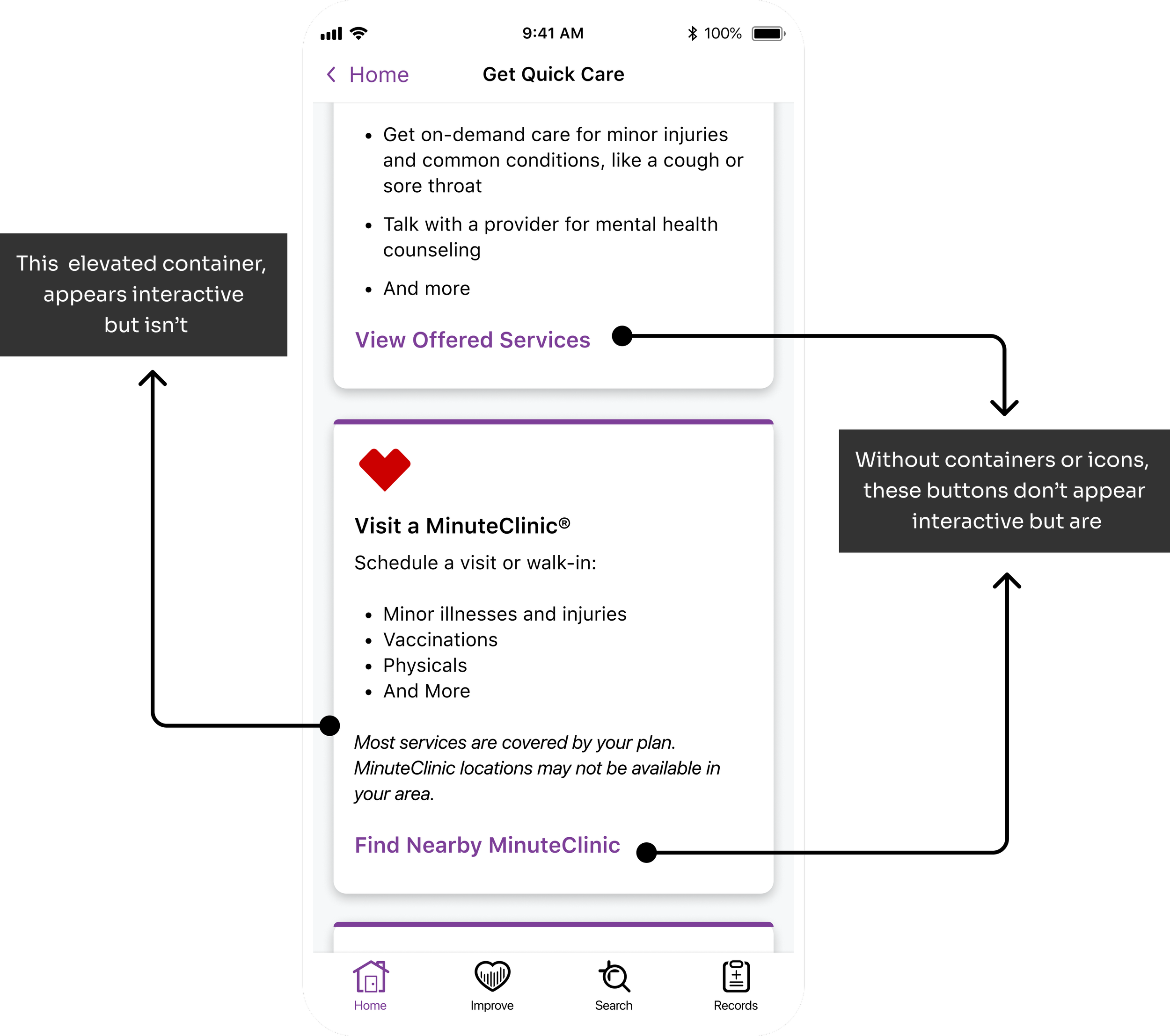
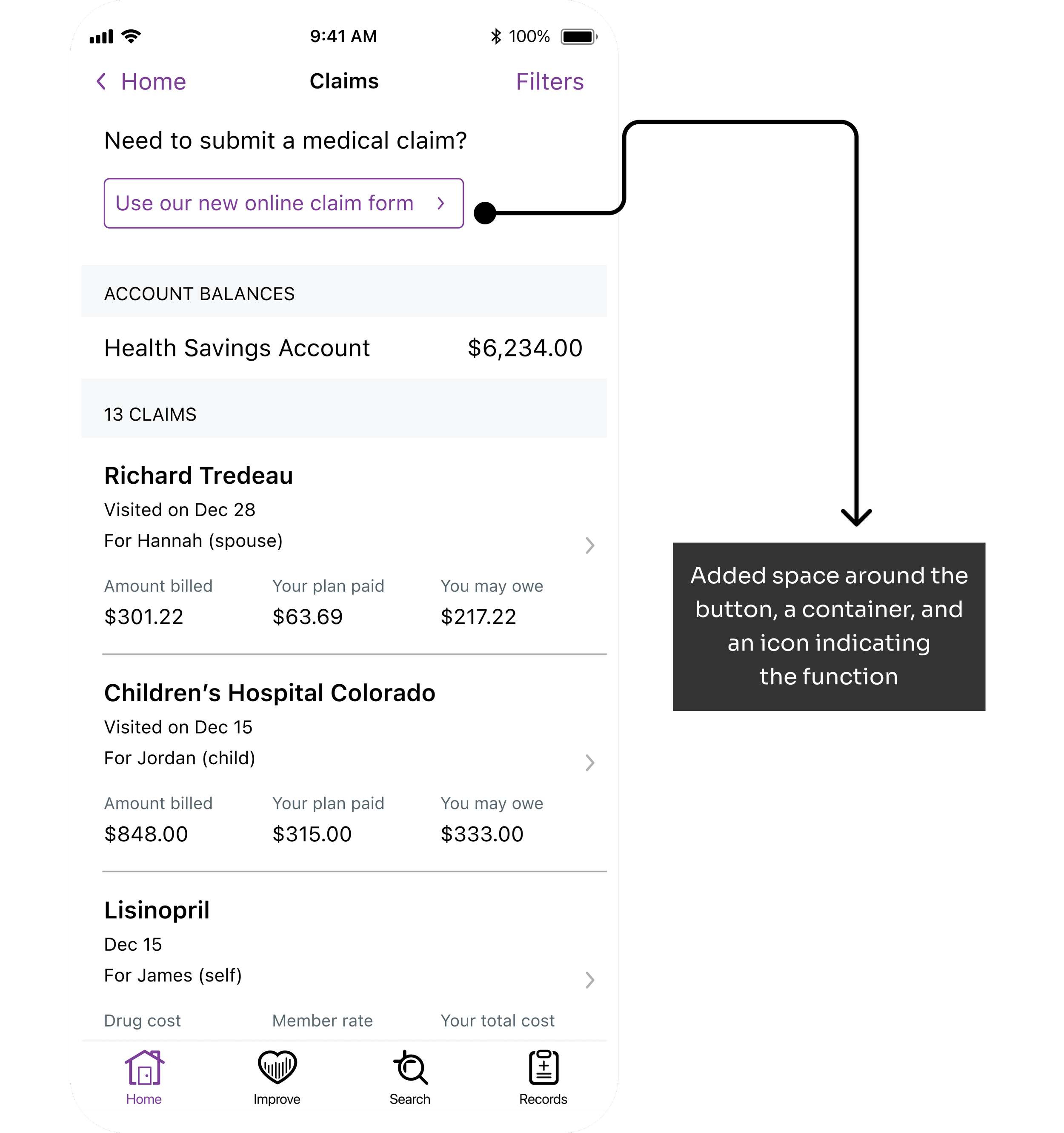
Most defects occur on “cards”, containers that group similar pieces of information. The entire card container appears interactive and therefore putting another interactive element on top requires a further distinction
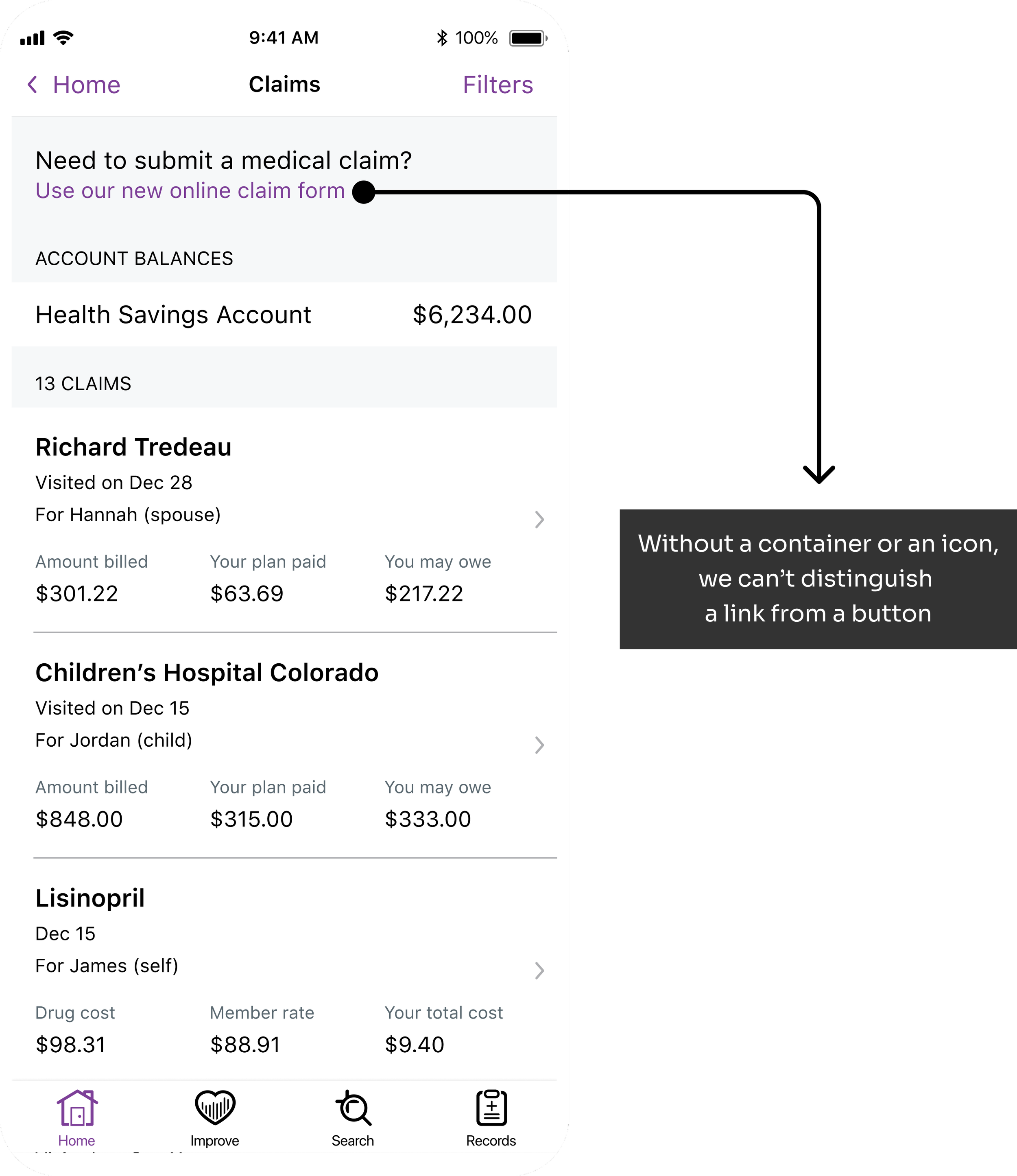
2) Links and buttons are indestinguishable
Links are used to navigate the user outside of the app whereas buttons navigate the user within it. Without a clearly defined container or icon or adequate affordance, our buttons could easily be mistaken for links within text and go overlooked by users.
3) Buttons on cards lack an additional visual indicator
Links are used to navigate the user outside of the app whereas buttons navigate the user within it. Without a clearly defined container or icon or adequate affordance, our buttons could easily be mistaken for links within text and go overlooked by users.

IDEATION
How might we leverage familiar design patterns?
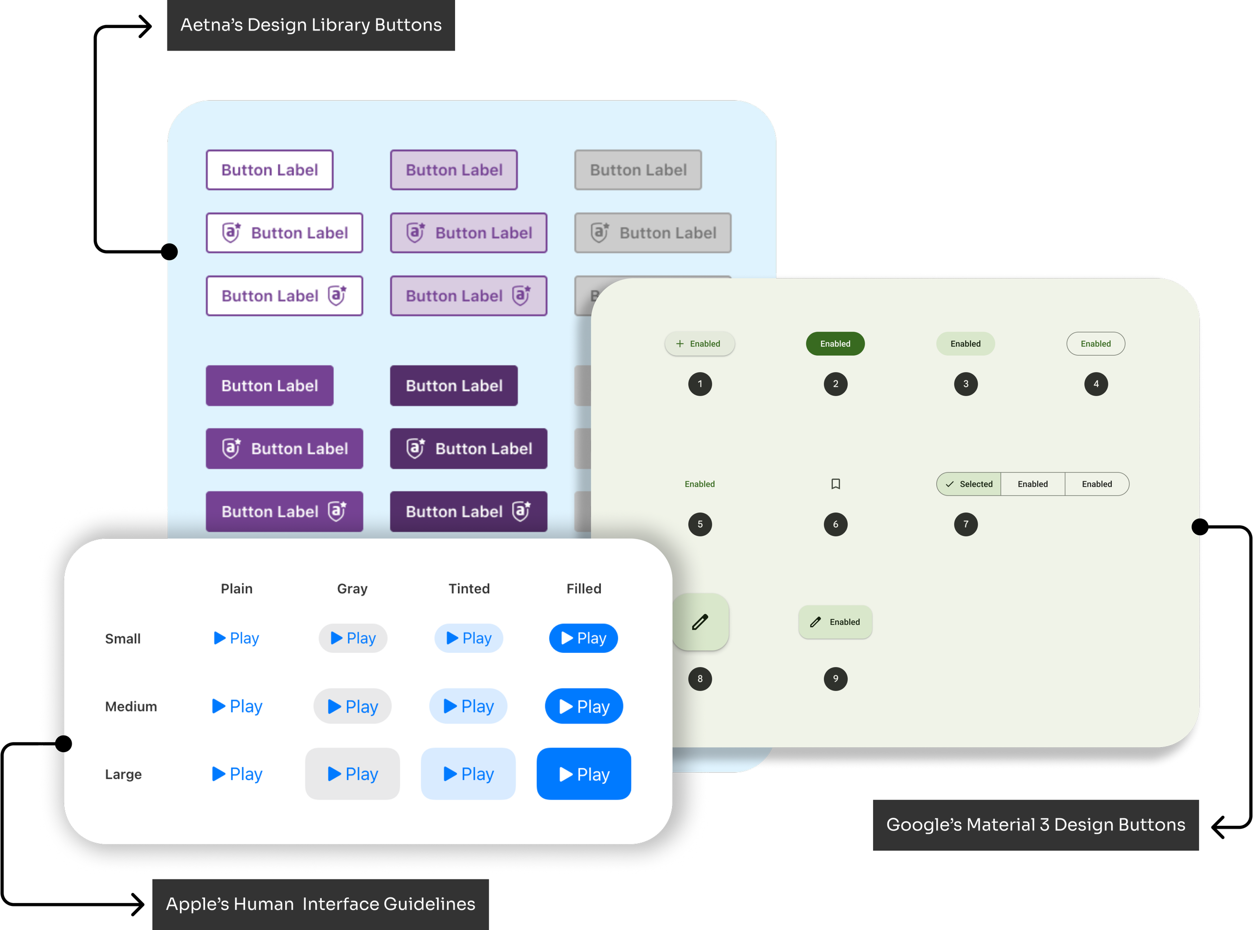
Looking at how our competitors tackled this problem, I understood that we didn’t have to reinvent the wheel. By digging through our existing native app library and cross-referencing the guidance of Apple’s Human Interface Guidelines and Google’s Material 3 Design System, I discovered that we could simply recombine our existing library components to create a new tertiary button that would significantly enhance user experience
IMPLEMENTATION
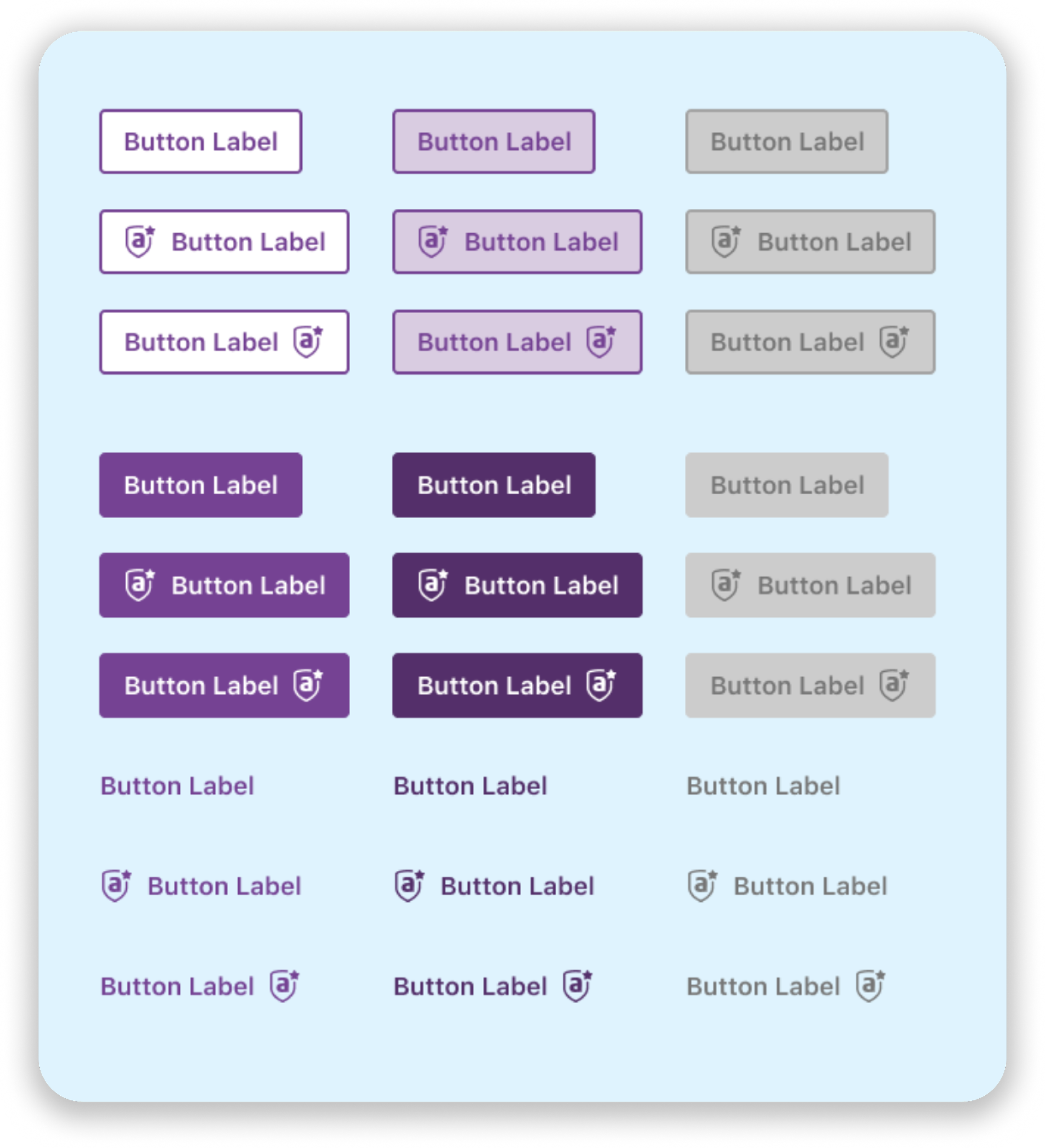
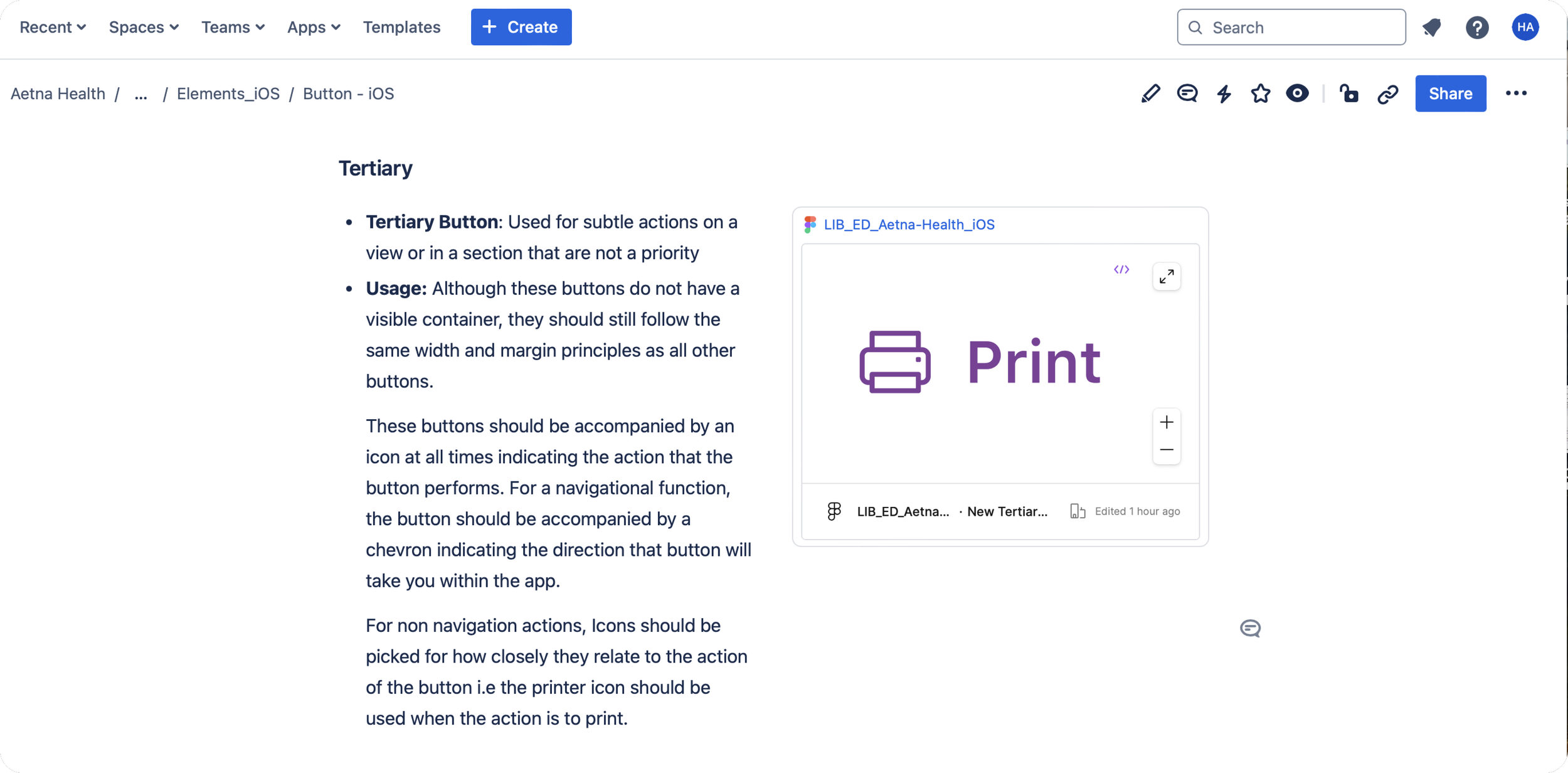
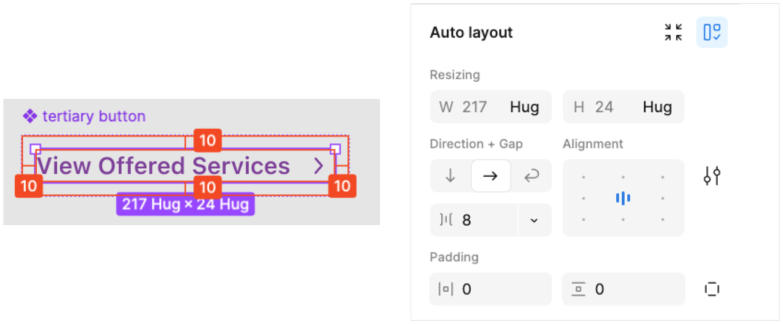
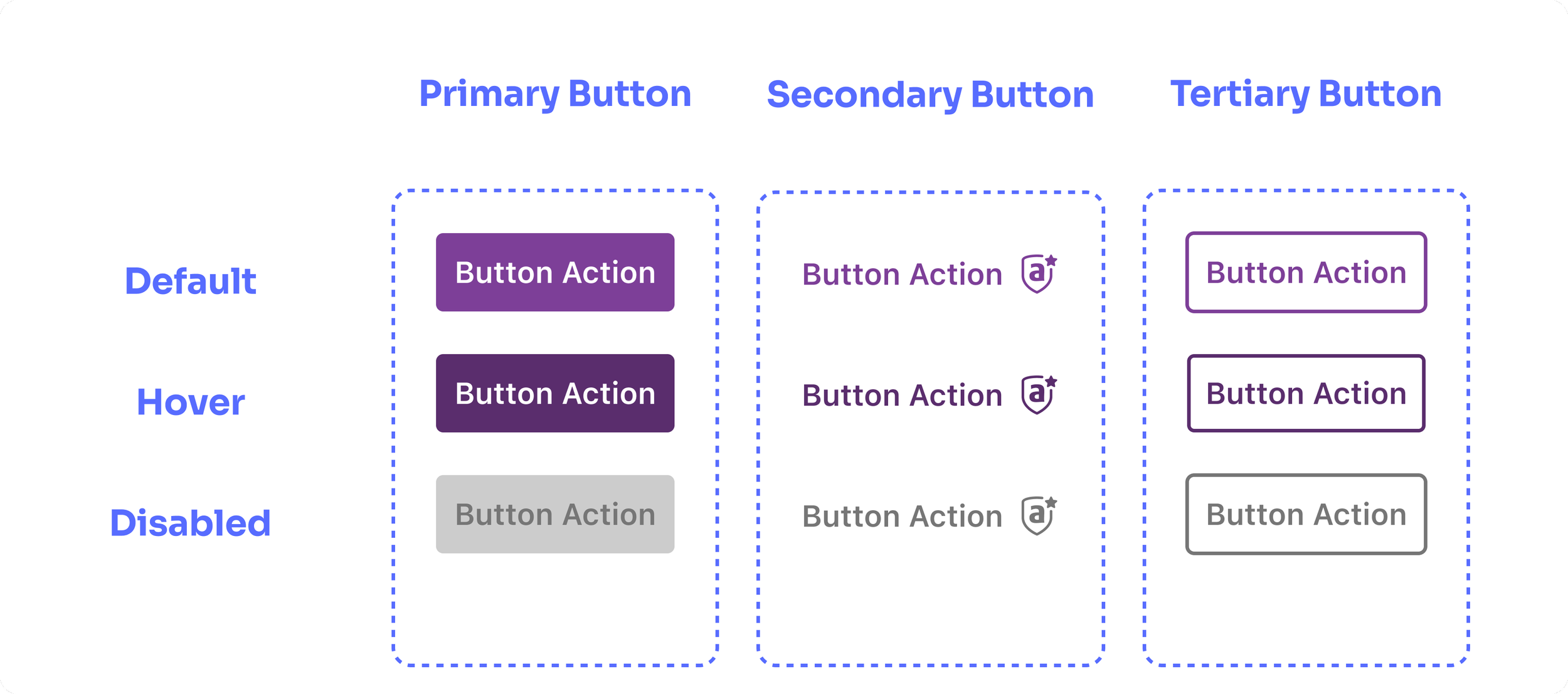
Component usage guidelines
With the help of Aetna’s Anatomy Team, I created a new tertiary button in our library and published a set of rules on how to use the button moving forward.
All tertiary buttons must have an icon indicating what the button will do
If the button is navigational, the icon will default to a chevron
In addition to the icon, all tertiary buttons will have a different color and heavier font-weight than the surrounding text.
FINAL DESIGN
A Better Button for Everyone
I published a revised tertiary button to our Aetna Design Library which has already improved the experience in the following ways.
Distinguishing Calls to Action on Cards
By better defining our buttons with an icon indicative of their function, we better inform the user of the action that can be taken within that container.

Addressing Links vs Buttons
By grouping every button with an icon, we better distinguish between our button interactions and our linked text, increasing the chance of being seen by visually impaired users.
OUTCOME
Improving accessibility for some improves the experience for all
It is now an established part of the design library and has been adopted by our entire design team.
LESSONS
What I learned
Embracing Evolving Design for Accessibility
Through our growing understanding of user needs, I learned the importance of continuously evolving components to improve accessibility. This openness and flexibility, especially from Aetna’s design team, taught me that even core elements, like the tertiary button, can and should adapt to better serve users.
Value of Detail and Impact of Small Changes
This project showed me the power of refining even the smallest elements in a design system. Watching a single button update positively influence the entire system reinforced that every detail matters and that minor adjustments can drive meaningful change.
A Mindset of Openness and Collaboration
Working alongside designers committed to accessibility inspired me to maintain an open, collaborative approach to design. This mindset, now foundational for me, is something I strive to bring to all projects, big or small